How to create 'Column chart' using HighCharts in MVC Application?
There are following step to create Column Chart.
Step 1.
Create MVC Application.
Step 2.
Add KeyValuePair Class.
example:
public class KeyValuePair
{
public string Key { get; set; }
public double Value { get; set; }
}
Step 3.
Add New controller with name 'HightChartsController'.
example:
using System;
using System.Collections.Generic;
using System.Web.Mvc;
namespace DotNetByPriyanshu.Controllers
{
public class HightChartsController : Controller
{
//to do here
}
}
Step 4.
Add Action method with name 'Charts'.
example:
[HttpGet]
public ActionResult Charts()
{
return View();
}
Step 5.
Add View for Charts.
example:
@{
ViewBag.Title = "Charts";
}
<h2>Charts</h2><br />
Step 6.
Add 'Div' for Column chart.
<div id="containerColumnChart" style="height: 500px; width: 500"></div>
Step 7.
Add Highcharts & Jquery links.
<script src="https://code.jquery.com/jquery-3.3.1.min.js"></script>
<script src="https://code.highcharts.com/highcharts.js"></script>
Step 8.
Add
example:
[HttpGet]
public ActionResult GetData()
{
try
{
List<KeyValuePair> objList = new List<KeyValuePair>();
KeyValuePair obj = new KeyValuePair();
obj.Key = "Delhi";
obj.Value = 44.2;
objList.Add(obj);
KeyValuePair obj1 = new KeyValuePair();
obj1.Key = "Bangalore";
obj1.Value = 26.6;
objList.Add(obj1);
KeyValuePair obj2 = new KeyValuePair();
obj2.Key = "Pune";
obj2.Value = 20;
objList.Add(obj2);
KeyValuePair obj3 = new KeyValuePair();
obj3.Key = "Patna";
obj3.Value = 3.1;
objList.Add(obj3);
KeyValuePair obj4 = new KeyValuePair();
obj4.Key = "Other";
obj4.Value = 5.4;
objList.Add(obj4);
return Json(objList, JsonRequestBehavior.AllowGet);
}
catch (Exception)
{
return Json("", JsonRequestBehavior.AllowGet);
}
}
Step 9.
Added Jquery for Column Char.
example:
$(document).ready(function () {
createColumnChart();
});
function createColumnChart() {
$.ajax({
type: "GET",
contentType: "application/json; charset=utf-8",
url: "/HightCharts/GetData",
dataType: 'json',
success: function (response) {
var aData = response;
var arr = []
$.map(aData, function (item, index) {
var i = [item.Key, item.Value];
var obj = {};
obj.name = item.Key;
obj.y = item.Value;
arr.push(obj);
});
var jsonArray = JSON.parse(JSON.stringify(arr));
drawColumnChart(jsonArray);
},
error: function (response) {
}
});
}
function drawColumnChart(seriesData) {
Highcharts.chart('containerColumnChart', {
chart: {
type: 'column'
},
title: {
text: 'Population percentage city wise'
},
xAxis: {
categories: [
'Delhi',
'Bangalore',
'Pune',
'Patna',
'Others'
],
crosshair: true
},
yAxis: {
min: 0,
title: {
text: 'Percentage'
}
},
tooltip: {
pointFormat: '{point.y:.1f} %'
},
plotOptions: {
column: {
allowPointSelect: true,
cursor: 'pointer',
dataLabels: {
enabled: true,
format: '{point.y:.1f} %',
style: {
color: (Highcharts.theme && Highcharts.theme.contrastTextColor) || 'green'
}
}
}
},
series: [{
name: "Brands",
colorByPoint: true,
data: seriesData
}]
});
}
Step 10.
Add link in Layout page.
example:
<li>@Html.ActionLink("High Charts", "Charts", "HightCharts")</li>
Consolidate Code:
C# Code with Controller:
using System;
using System.Collections.Generic;
using System.Web.Mvc;
namespace DotNetByPriyanshu.Controllers
{
public class HightChartsController : Controller
{
[HttpGet]
public ActionResult Charts()
{
return View();
}
[HttpGet]
public ActionResult GetData()
{
try
{
List<KeyValuePair> objList = new List<KeyValuePair>();
KeyValuePair obj = new KeyValuePair();
obj.Key = "Delhi";
obj.Value = 44.2;
objList.Add(obj);
KeyValuePair obj1 = new KeyValuePair();
obj1.Key = "Bangalore";
obj1.Value = 26.6;
objList.Add(obj1);
KeyValuePair obj2 = new KeyValuePair();
obj2.Key = "Pune";
obj2.Value = 20;
objList.Add(obj2);
KeyValuePair obj3 = new KeyValuePair();
obj3.Key = "Patna";
obj3.Value = 3.1;
objList.Add(obj3);
KeyValuePair obj4 = new KeyValuePair();
obj4.Key = "Other";
obj4.Value = 5.4;
objList.Add(obj4);
return Json(objList, JsonRequestBehavior.AllowGet);
}
catch (Exception)
{
return Json("", JsonRequestBehavior.AllowGet);
}
}
}
}
public class KeyValuePair
{
public string Key { get; set; }
public double Value { get; set; }
}
View:
@{
ViewBag.Title = "Charts";
}
<script src="https://code.jquery.com/jquery-3.3.1.min.js"></script>
<script src="https://code.highcharts.com/highcharts.js"></script>
<h2>Charts</h2><br />
<div id="containerColumnChart" style="height: 500px; width: 500"></div>
JQuery:
$(document).ready(function () {
createColumnChart();
});
function createColumnChart() {
$.ajax({
type: "GET",
contentType: "application/json; charset=utf-8",
url: "/HightCharts/GetData",
dataType: 'json',
success: function (response) {
var aData = response;
var arr = []
$.map(aData, function (item, index) {
var i = [item.Key, item.Value];
var obj = {};
obj.name = item.Key;
obj.y = item.Value;
arr.push(obj);
});
var jsonArray = JSON.parse(JSON.stringify(arr));
drawColumnChart(jsonArray);
},
error: function (response) {
}
});
}
function drawColumnChart(seriesData) {
Highcharts.chart('containerColumnChart', {
chart: {
type: 'column'
},
title: {
text: 'Population percentage city wise'
},
xAxis: {
categories: [
'Delhi',
'Bangalore',
'Pune',
'Patna',
'Others'
],
crosshair: true
},
yAxis: {
min: 0,
title: {
text: 'Percentage'
}
},
tooltip: {
pointFormat: '{point.y:.1f} %'
},
plotOptions: {
column: {
allowPointSelect: true,
cursor: 'pointer',
dataLabels: {
enabled: true,
format: '{point.y:.1f} %',
style: {
color: (Highcharts.theme && Highcharts.theme.contrastTextColor) || 'green'
}
}
}
},
series: [{
name: "Brands",
colorByPoint: true,
data: seriesData
}]
});
}
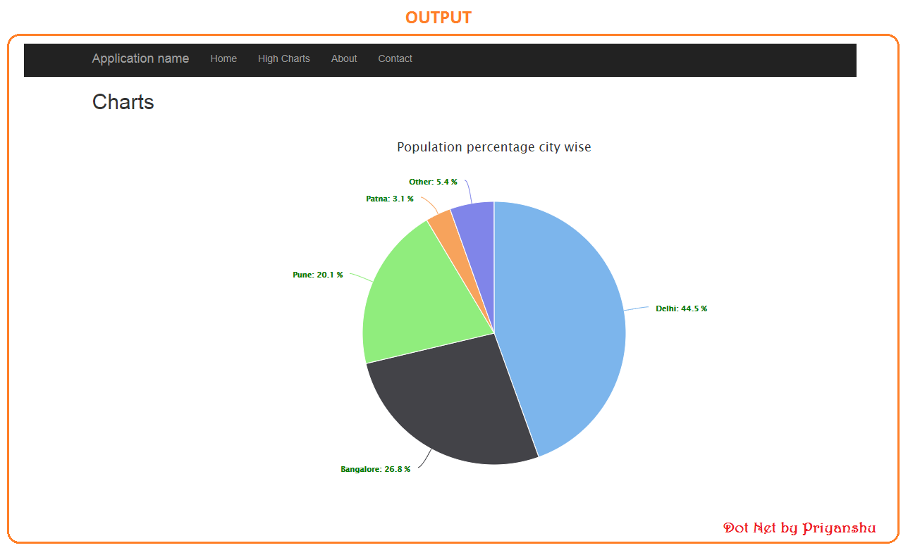
Output: